 +971 50 5473745


Designing for Emotion: How Colors and Fonts Affect User Sentiment

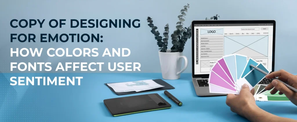
The psychology behind design choices and their impact on users
Every component of web design that you select has a major impact on user experiences and perceptions. Colors and fonts are probably the strongest factors among all such elements as they affect aesthetic aspects, but also emotional responses and actions of users. Here, we will discover the psychology behind these design choices and how such can affect user sentiment.
The Emotional Aspect of Colors
Colors in design impart their emotional and communicative connotations. Many colors or shades will stir different feelings and reactions among users. This commentary is envisioned to discuss how people would generally visualize different colors.
- Red: Passion, urgency, stimulation, and strong emotions are often related to red. It often focuses on grabbing attention and taking immediate action.
- Blue: Calming effects of the blue color are usually linked to assurances, safety, and professionalism. Major companies use blue for most of their branding to inculcate trust.
- Green: Nature and health are the main signifiers of which green symbolizes peace with many representations of growth. It is one of the colors in demand by brands aimed at sustainability.
- Yellow: typically signifying hope and cheerfulness while it may at times act as cloying if used in large doses. So it must be used cautiously.
- Purple: Numbered amongst the luxury, knowledge, discernment, and sophistication-oriented colors, purple evokes orders of feelings ranging from elegance to those straddling creativity.
- Black and White: These are black's constituents as an association of sophistication and elegance alongside white as signifying simplicity and cleanliness. This brings forth an excellent contrast.
Choosing the Best-Looking Color Palette
One part of web design is also thinking up what kind of emotions you want to induce in users. It is important to choose colors that make up a color palette that can be used to express and reinforce your brand message in the engagement of users. Take, for example, the health brand Soft greens and subtle blues instill a sense of calm while the e-commerce site may use more vibrant reds and yellows to create that sense of urgency and excitement during a sale event.
What Fonts Can Do?
Fonts form part and parcel in any design and affect legibility and the general tone of the message. The types of typography can speak of personality, profession, and feelings from the general public. These are the differences in the impacts of font styles on user sentiment:
- Serif Fonts: This is the font family like Times New Roman which makes people see it more traditionally and reliably while being associated with feelings of trust and authority. It is best suited to things like law firms or financial institutions.
- Sans-Serif Fonts: Arial and Helvetica are examples of these types of fonts that give a touch of modernity with a clear vision. These fonts are used more in tech and digital products because they are readable.
- Script Fonts: Fonts that imitate cursive handwriting give an elegant but rather personal touch. It becomes very hard to decipher them when written in chunks, hence best for headings and branding elements.
- Display Fonts: Super style and attention-seeking display fonts can be used to express creativity and individuality but they should be used very sparingly because they can easily overload users.
Creating a Typography Hierarchy.
It is quite necessary to have an ironclad typography hierarchy that walks users through your content. Set different font sizes, weights, and styles to render a visual interest for the reader and emphasize key pieces of information. It makes it easier to read, besides showing how they perceive your brand.
The Recipe for Colors and Fonts
Colors and fonts together can increase the emotional potency of your design. Chalk it, a bold, modern typeface with a bright palette, can produce an edginess, modern youthfulness for your brand. Otherwise, a flat and soft serif font with muted hues may suggest coziness and reliability.
Ensure Consistency is Permanent
Consistency is the thing that goes with all your colors and fonts used on your whole site and marketing material to achieve maximum brand awareness. Cohesive design thus sort of reinforces the identity of the brand and makes users much more comfortable and attached to that message.
Venturing Further in the Design for Emotion Dialogue: The Ways Colors and Fonts Influence the Mood of a User
Having examined the basic principles of how colors and fonts influence user sentiment, there are several additional factors that would have to come into play in order to achieve level two in emotional web design. These include cultural considerations, accessibility, and practical implementation. We shall go much into these aspects.
Cultural Context vs. Color Perception
Colors do not exist in vacuums; they are seen through culture-influenced lenses. Two cultures would ascribe different negative statements about the same color. For instance:
- Red: Red usually stands for love and passion according to the West, yet for many East Asians, red is a symbol of good fortune and happiness.
- White: In Western countries, one associates white with purity-weddings. On the contrary, however, in some Eastern cultures white means mourning-loss.
- Green: In the Middle East, green is sacred to Islam, but in the West, it is related to nature and health.
Knowing Your Audience
It is very important to include multicultural differences in color perception when designing a website intended for a global audience. Researching the target demographic can help the color choices actually connect with the audience in a manner that is positive across cultures.
Accessibility for All Users
Design for all users: Building accessibility in part of your design choices is a legal requirement in several parts of the world. These design choices influence users who are visually impaired, e.g., color blindness or dyslexia.
Best Practices for Accessibility:
- Color Contrast: Text and background colors should be extremely contrasting to make reading efficient. You can check if your color combinations match accessibility standards by using WebAIM Contrast Checker.
- Don't Rely on Color Alone: Color is not sufficient in isolation for any meaning. Use text labels, shapes or patterns as complementary cues to color.
- Legibility of Fonts: Choose easy-to-read fonts and never use too decorative fonts for body texts. Generally, sans serif fonts do well in legibility on screens.
- Text Size and Space: All text sizes should be resizable and should possess enough spaces between lines and paragraphs to improve readability for all types of users.
Practical Implementation Tactics
Having discussed the psychological effect of colors and fonts, we now move towards practically instituting these elements appropriately into your design process.
- Mood Boards: Prepare mood boards for different moods and emotions you want your brand to evoke in individuals, with colors and fonts cleverly combined in the making. Use such an image as a guide to designing your whole project in harmony.
- A/B Testing: Run a series of tests on various color and font combinations to figure out which would suit your audience's needs best. A/B testing can lead to some good informative discoveries about user choices and behavior.
- User Feedback: Get user attention to know the reactions about your choice of design. Surveys or usability testing could be mechanisms with which you may wish to check how people feel about your selections in color and fonts.
- Brand Guidelines: Hence, all the descriptions of the effective elements of the palette, the chosen fonts, and their emotional aspects should appear as a single set of all measure brand guidelines. Thus ensuring uniformity of presentation in marketing material and all the pages on the website.
- Responsive Design: Photograph the way you put colors and fonts together, then put it to the test on different screens and devices. Verify that your designs are carrying their emotional weight across mobile, tablet, and desktop viewing experiences.
Case Studies: Successful Brands and Their Choices
To comprehend the significance of color and font as described by the theory, let us consider some successful brands that have practically mastered these aspects to communicate certain emotions:
- Coca Cola: The signature red and white colors look shiny and cheerful which complements the brand’s focus on happiness and sharing. The font used is a ‘soft serif’ shows authority combined with family.
- Apple: Clean sans serif typography along with monochrome colors make apple”s products even more aesthetically appealing. The calmness associated with the colors embodies sophistication, innovation and elegance which syncs with the audience’s perception of the products.
- Starbucks: The green color scheme is associated with environmental consciousness and fertility whereas the striking serif font evokes warmth and families. The combination of all these helps encourage customers to explore all what is offered
Conclusion: Design as a Timeless Medium of Expression
It is indeed crucial to remember the role that colors, shapes, and fonts have on the users’ perception of a web design when creating one, as it has been depicted all throughout the article. When done properly, this will allow the users to build a strong bond with the webpage and enhance their overall experience while browsing.
As you advance in your profession and skill set while practicing web design, do not forget the reason you are doing all of this in the first place; which is what the end user will get to see. This means that every time you position an image, choose the font, or skewer the layout of a webpage, do not forget that you are actually shaping the user’s experience.
Increase Your Online Competence with HelloPixels: #1 Web Design Firm in UAE!
At HelloPixels, the best web design company in UAE, we are focused on building beautiful and functional websites that convert. Our team of designers and developers is familiar with the psychology of color, and typography. Therefore, we place every design decision to create an emotional connection with your audience. If you are a new business wishing to grow or an established business that wants to improve the image of an existing business – we customize our services to suit the different clients and their requirements and objectives.
We are the most reputable web design agency in UAE. This is because we implement the current design concepts and technologies in developing websites that are not only attractive. Our promise on accessibility and good user experience means your target website will attract and retain clients and convert prospects into sales. Let HelloPixels take your online platform to a higher notch and accomplish your business targets. Talk to us today as we prepare to take you through the steps of your outstanding online experience
Building Your Brand Through Web Design in 2025
Your website is your identity in the digital world today, and often, it's that first point of conta

Immersive Web Experiences: AR, VR, and 3D Without the Bloat
In 2020, immersive web design meant loading 50MB of Three.js assets, crashing mobile browsers, and a
Difference Between a Template and a Custom Website? (And Which One Is Right for You?)
In today’s digital-first world having a well designed website is more important than ever. But whe


