 +971 50 5473745


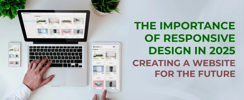
The Importance of Responsive Design in 2025: Creating a Website for the Future

Why Responsive Design Matters
- Improved User Experience: A responsive website will ensure that users can navigate through and interact with the website's content with ease. Not only will this lead to increased engagement, but it will also decrease the bounce rate.
- SEO Benefits: Google and other search engines rank mobile-friendly websites higher. A responsive website does not require separate mobile URLs. Thus, efforts in terms of one website need no redundant engagement.
- Cost Efficiency: Having a single responsive website will be cheaper for you in terms of development and maintenance than maintaining different websites for desktop and mobile versions.
- Future Proof: Next gen devices and different screen sizes are coming thick and fast, so responsive design helps your website prepare for what's coming around the bend, keeping it relevant, working, and with greater appeal.
- Conversion Rates Increase: A rich user experience on every device increases conversion rates: users are more likely to take desired actions on a site that suits them.
10 Must Have Best Practices for Responsive Web Design
1. Fluid Grid Layouts
Fluid grids form the backbone of responsive design. You define widths by using percentages instead of fixed pixel-based layouts. So, it ensures elements will resize proportionally so you can create a harmonious and adaptable design.
Tip: Use one of the many CSS frameworks built with built-in grid systems, such as Bootstrap or Foundation, to ease working with fluid layouts.
2. Flexible Images and Media
3. Mobile-first Design Priority
Mobile-first design calls for one to design with the lesser screen and incrementally optimize for more extensive screens while ensuring all important content stands out in making the appearance clean and functional on every device.
Tip: Start from a lean layout that provides the essentials and add enrichment as screen size increases.
4. Use Media Queries
Media queries are a very versatile tool in responsive design allowing you to apply different styles based on specific conditions with regards to screen width height and orientation. In a way, you can present your design in such a light that suits the devices, optimising the view experience at its best.
Tip: Start with breakpoints of common sizes that correspond to popular device sizes, then refine from there based on actual behavior.
5. Cross-testing with device and browser combinations
Testing is incomplete without a responsive design. So, check out whether all devices, operating systems, and browsers work well with your website. This is the step to detect inconsistencies or problems that might influence user experience.
Tip: Use tools such as Google’s Mobile-Friendly Test, BrowserStack or responsive design testing tools, to test how your site will perform in these types of environments.
6. Typography optimized for multiple screen sizes
Best Practices:
- Use relative units like em or rem instead of fixed units like px for font sizes, so text scales better between screen sizes.
- Create a fluid typography system where font sizes adapt to the width of the viewport. In terms of CSS, such could be managed using techniques such as clamp().
7. Design for Touch Interactions
Best Practices:
- Ensure that the buttons are large enough to touch (at least 44x44 pixels or bigger).
- Make sure there is adequate white space between clickable elements so that the accidental tap is avoided.
8. Reduced loading times
Best Practices:
- Optimize images with the correct file format like WebP, JPEG, or PNG, while not losing the quality. Others are using lazy loading of images and videos, which simply means that images and videos are loaded only when they come into the user's viewport to save initial loading time.
9. Minimize Navigation
In terms of user experience, speed is particularly crucial here because on mobile devices, the user might be on a slower connection. Reduction of loading time can improve engagement and retention quite strongly.
Best Practices:
- Offer a hamburger menu or a collapsible navigation layout for mobile views to minimize space while allowing users to click on the most valuable links.
- Utilize clear terms and symbols to guide viewers through your website.
10. Content Delivery Networks
Best Practices:
- Use a trusted CDN which offers reliable caching and optimization upon delivering images, scripts, and stylesheets.
- Make sure that your CDN delivers static assets and that your web server is the one who handles your dynamic content.
10 Tips for Building Responsive Websites
1. Know your audience
2. Use a Responsive Framework
2. Use a Responsive Framework
@media only screen and (max-width:768px) {
/* Tablet */
}
@media only screen and (max-width:480px) {
/* Mobile */
}
4. Above the Fold
5. Use CSS Flexbox and Grid
6. Test Responsiveness on Real Devices
7. Minimize Pop-ups and Interstitials
8. Implement progressive enhancement
Start with an easy, functional design work on all devices, progressively enrich it with more detailed elements depending on the screen real-estate. This way it sets a solid foundation which offers richer experiences on stronger hardware.
9. Use web analytics in performance
10. Learn best practices and alterations
Conclusion
Enhance your business with the leading web design firm in Abu Dhabi!
Typography Trends 2026: Bold, Expressive, and Conversion Focused
In 2026, typography has moved from supporting actor to leading role. The trend toward bold, expres s

Web Design Trends to Watch: What’s Hot in 2025?
Web design in the next couple of years is going to be extremely fast-paced, led by technologies, use

The Ultimate Guide to Dark Mode Web Design in 2026
In 2026, dark mode isn’t a design trend — it’s a user expectation. With 81.9% of smartphone us


